- By Ricardo Fantes
In professional sports, a logo isn’t just a symbol—it’s an emblem of identity, pride, and legacy. For the Miami Dolphins, a franchise deeply intertwined with the South Florida community, their logo is a visual narrative that captures their past, present, and future. Since its founding in 1966, the Dolphins have thoughtfully evolved their logo to reflect the team’s journey, balancing tradition with fresh, modern design.
The Creative Journey: From Vision to Reality
The latest major evolution began on April 25, 2013, when the Dolphins revealed the fifth iteration of their logo, a project that took 18 months to complete. The Dolphins’ leadership knew that the logo wasn’t merely a cosmetic feature—it was the face of the franchise. According to the Miami Dolphins Media Guide, the design process included input from team owners, former players, and the dedicated fan base. The result was a logo that respected the Dolphins’ storied past while resonating with contemporary fans, capturing the essence of Miami’s vibrant culture and the team’s competitive spirit.
Honoring Tradition: Aqua and Orange
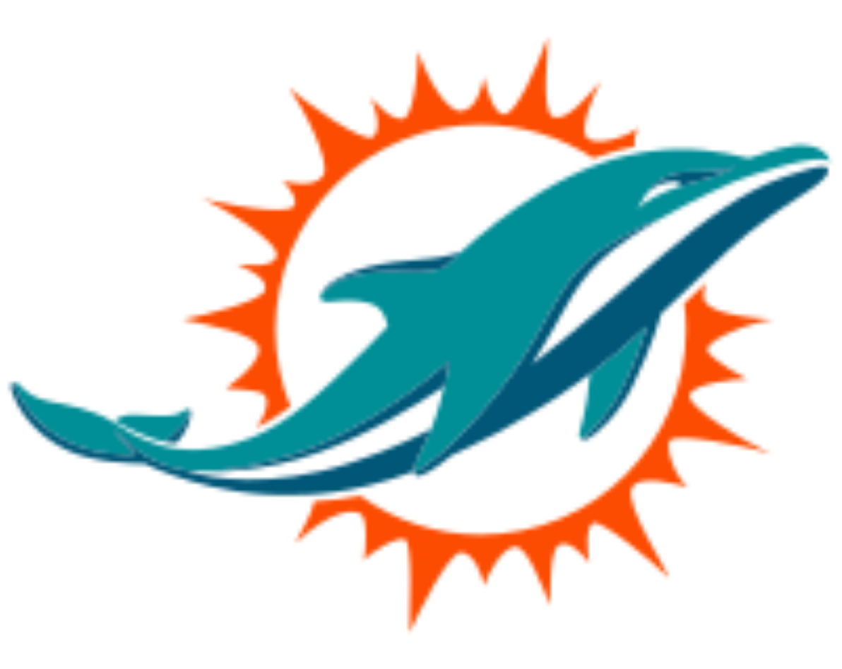
One of the most cherished aspects of the Dolphins’ logo evolution has been the color palette. The iconic aqua and orange, long associated with the team and the Miami community, got a refreshing update in the 2013 redesign. Inspired by the Atlantic Ocean, the refined aqua shade and marine blue brought new depth. At the same time, a brighter, more vibrant orange represented the South Florida sun, adding energy and warmth to the logo.
The colors were further refined in a 2018 update, which darkened the orange to a rich, almost red hue, adding intensity and depth. This change symbolized the team’s relentless drive and competitive spirit, aligning perfectly with the Dolphins’ mission to honor their roots while energizing their brand.
The Dolphin and the Sun: Power and Continuity
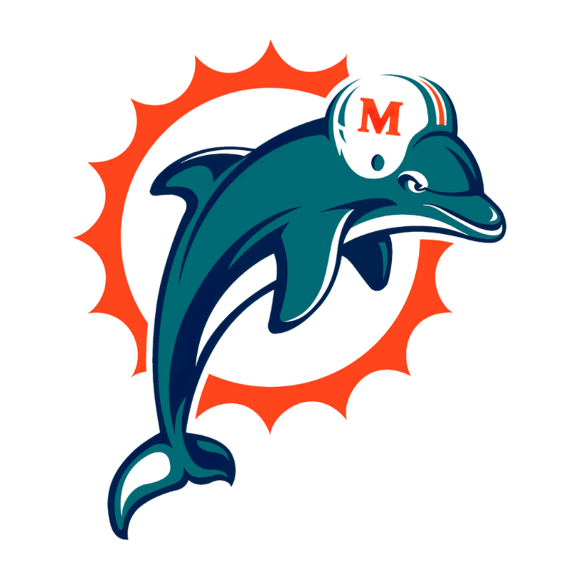
Central to the Dolphins’ identity, the dolphin and the sun have remained essential elements of the logo. In the 2013 redesign, the dolphin was depicted in a powerful leap, symbolizing agility and strength—qualities the team strives to embody on the field. The sunburst was also updated, adding more rays to reinforce Miami’s sunny climate and vibrant community ties.
The 2018 update brought subtle refinements to the dolphin’s form, emphasizing speed, agility, and momentum. With a simplified tail fin and streamlined body, the dolphin now appears sleeker and more dynamic, enhancing its adaptability across various media, from stadium screens to mobile apps.
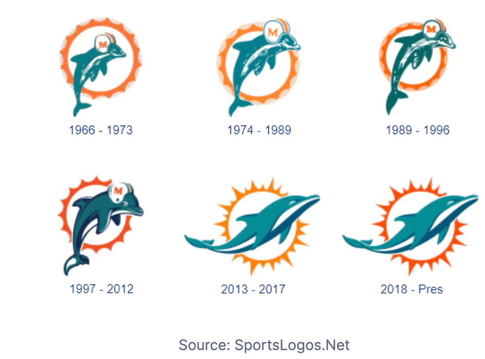
A Legacy of Evolution: The Journey from 1966
The Dolphins’ logo has undergone thoughtful transformations since the team was established. The original 1966 design featured a playful dolphin leaping before a sunburst, with a palette of aqua, coral, and white. Over time, each redesign reflected the team’s growth, from the intensified aqua of the 1970s to the navy accents added in 1997, which gave the logo a bolder, more defined appearance.
In each iteration, the Dolphins have skillfully balanced new design trends with iconic elements, creating a timeless look that resonates with fans. This attention to detail in every redesign reflects the team’s commitment to respecting their legacy while evolving their brand identity.
The 2018 Logo: Balancing Tradition with a Modern Edge
Praised for its ability to blend tradition with modern aesthetics, the 2018 logo retained the beloved elements of previous versions while refining the emblem for today’s digital landscape. Clean lines, bold colors, and a simpler design made the logo more versatile, ensuring it stands out on screens, merchandise, and stadium signage.
A Symbol of Legacy and Connection
For Miami Dolphins fans, the logo is more than an image; it’s a source of pride representing the franchise’s resilience and connection to Miami. From the original helmeted dolphin of the 1960s to today’s streamlined, powerful icon, the Dolphins’ logo evolution mirrors the team’s dedication to growth, honor, and community.
As the Dolphins continue their journey, the logo reminds them of where they’ve been and where they’re headed. It’s a visual story of tradition, ambition, and the unbreakable bond between a team and its fans in one of the world’s most vibrant cities.